We'll start the year's prototype building photos with something a bit different.
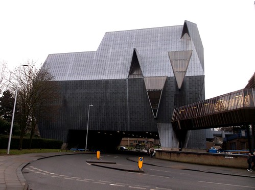
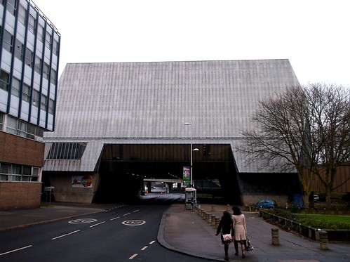
"The Elephant" as it's commonly known, after the creature in the centre of the city coat of arms, is an extension to Coventry's 1966 swimming baths and was completed a decade after these opened. Designed by the council architects team lead by Arthur Ling, there were the sort of building problems and design issues that we still hear of today.

Sadly, while the baths themselves are listed, even though they will be demolished as too expensive to maintain, The Elephant isn't. Apparently one of the issues that it isn't by a proper, famous architect. It seems that listing is driven by celebrity rather than architectural merit.
I'm not going to claim this is a beautiful building - it's isn't. What it is is an interesting one.The shape would easily fit into a 1970s sci-fi series. There is also a hint of the much-lauded Selfridges store as it's a odd shape that doesn't immediately fit into the surrounding landscape. Mind you, that landscape includes the infamous ring road, so that's no bad thing.
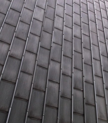
Modellers might be put off by the building being so iconic, but at least it would reasonably simple to build. Made from flat surfaces clad in lead, the hardest decision would be whether to add all the individual sheets or scribe the surface and then add the raised strips.
Even after 40 years, the lead hasn't weathered much. In miniature, you could get away with a slightly mottled spray painting rather than attacking each panel.

I'll admit I'll be sad to see The Elephant vanish. It will doubtless be replaced with a dull building that looks just like everything else. Coventry isn't awash with interesting structures, can they afford to lose this one?
Actually there is quite a bit of Coventry that has architectural interest. The first post war mainline station for example. and the circular market building. Oh and the cathedral of course.
ReplyDeleteInteresting isn't the same as attractive orgood, mind you.
I'm a fan of the market building and also the round cafe (now Neros but once a bruger bar) in the shopping centre. I think we undervalue 50s and 60s buildings. Many have been badly altered over the years and lost the original design under a weight of "improvements".
ReplyDeleteThe station is still pretty clean and original, as is Banbury down the line. Both from an era when optimism played a big part in design. Yes, we lost important buildings but at least people wanted to look to the future and make new things. Now we try to wallow in a past that never existed and try to avoid doing anything interesting.
I've looked at that for a long time and I really can't see anything to like about it.
ReplyDeleteI see the thoughts about making a better future and optimism playing a big role. Maybe.
It still looks like a grandiose vanity project to me, a waste of good lead.
Mind you, if it was left to me we'd be making buildings of timber and cob. Thank goodness we are all different.
Thanks for some feedback on merry ol' England. I love trips down through history. Sounds like train stations weathered well...
ReplyDelete