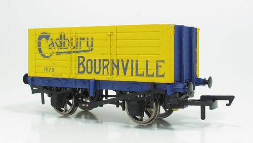
The most striking thing about the Cadbury wagon is the colour. Quite how it ended up bright yellow is a mystery but that's what we've ended up with. (I know that someone disputed the colour here on Tuesday but he is a Great Western modeller and so his judgement is already suspect)
The only photo I have to work with is this one:
found on the Black Dwarf Lightmoor website. The original appears on Page 29 of Keith Turton's eight colleciton of Private Owner wagons.
From this the ends appear top be the same colour as the solebars. After a little discusion, the best guess is that this colour is the same as the wording on the side - blue. Pity as I was hoping for red but never mind.
So, the solebars and end between the corner plates have recived a coat of Humbrol 25 and very bright the result looks too. I can't see the wagon lasting long in this sort of state so a dose of weathering is in order.

5 comments:
Looking at that photo I think you've painted on too much blue. I agree the end support posts appear the same colour as the sole bars (so blue) but I think the rest of the end is the same colour as the side. The reason it looks darker is that the uprights are casting a shadow.
Cadbury's boats were yellow and purple, quite a dark purple. It stands to reason that their PO wagons would be the same scheme rather than blue.
Good points. Too late to do anything about it on this wagon without a repaint (see tomorrows post) but it would be easier to start with a fresh body anyway (that's also what I say when I'm in the gym).
I thought it was shadow at first glance, but then the facing edge of the end stations would be the same shade as the wagon sides, so I reckon to stay with the colour change.
It does look bright, but then it's an advert so it would be. A little toning down and u/f dirt will make it all nice.
CF
OK that is a better photo you've referenced than the version of it I have - which I suspect might actually have been edited to resolve Mark's point about the ends. I thought the canal boat livery used purple for the background, which is very different. See Chocolate on the Shroppie http://www.richardhill.co.uk/in-print
On the other hand I've seen several Cadbury Cocoa adverts of around this period that had a yellow background and red lettering.
Post a Comment