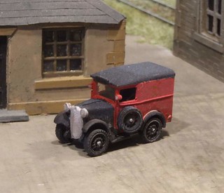
 I can't resist posting a picture of the finished PO van. A little bit of digging on the interweb provided me with the correct colour scheme, or at least what I think is the correct one.
All this surfing revealed that people who preseve these things don't all paint them in the same colours. Maybe the local depots had a different take on the correct livery but I doubt it. The Post Office was always a pretty strict organisation.
Every example displayed a black bonnet and chrome grille but elsewhere there were some other bits in black around the windscreen. I pondered putting these in, my new Trumpeter brush was holding its fine point very well, but in such a tiny scale they could look a bit heavy.
Worse, the script "Royal Mail" over the crown on the side is either gold or black depending on whose version you are looking at. I went gold but can't be sure I'm right, the photo on the left would tend to suggest I am wrong. This is an area where I am sure the Postmaster General would have laid down the law.
Not to worry, the model looks nice enough. A little weathering courtesy of a thin wash of dark brown is all the dirt I needed. Some post washing lackey would doubtless have removed all the filth each day so there's no need to serious deposits.A little light much just highlights the detail.
.jpg/320px-Morris_Minor_M8_Post_Office_Van_(1935).jpg)
1 comment:
Looks a cheeky and chirpy little chap.
Post a Comment