Supervising a fine art lecture last week, I became a bit of a expert on Trompe-l'œil. For those not as well educated in the fine arts as myself, this is a French term that means "'deceive the eye'". In other words, 2D paintings that are intended to fool the eye into thinking it is looking at a 3 dimensional subject.
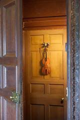
 The most famous example in the UK is at Chatsworth House, where a violin appears to hang on the back of a door in the music room.
 The instrument is in fact simply paint and as flat as the door. Odd really, since you could have probably bought a real violin for less money than having an artist paint the fake version. On the other hand the pleasure of watching people being fooled by it must have made it worth it !
I'm not going off on a fine art kick in this post though, the point is that we modellers employ Trompe-l'œil techniques in our work. The most common of these is shading surfaces to increase the apparent surface detail - I dry-brush everything to highlight rivets and seams. Many also underpaint grooves or run dark colours into creases to accentuate shadows.
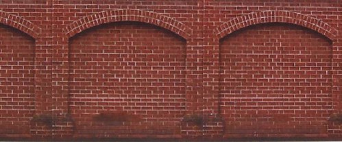
At the extreme end you have examples such as the one at the top of this post. These arches are on a printed sheet from Trutexture and look surprisingly effective. The firm use the same technique to even greater effect in windows and doors. On a model railway layout, from a distance, they will look the business. Perhaps not for the models on the very front of the baseboard if you are a detail nut, but perfectly acceptable for most of us from normal viewing distances. After all, it's unlikely that the buildings are the main focus of the layout, people tend to look at the choo-choo's.
There is one sphere where they will look perfect of course - the model railway magazine. Trompe-l'œil never look better than when seen in photos. Thus you could build your layout with the intention of it appearing in print or on the web knowing full well that it will look fab on the page but less good in the flesh.
Maybe that doesn't matter. I know of at least one layout that was lauded in the finescale press for its buildings produced from computer printouts and with no more relief that the Graham Farish N gauge buildings that were made from stickers on plastic boxes. According to the editorial this was a revolution as the pictures looked lovely. In real life though, it's a bit of a disappointment, to me anyway, as the technique has been over-used for every structure and not just the background ones it works best on.
How do you feel ? I'm happy to accept Trompe-l'œil techniques have their uses. Making arches is a grim job and this makes it easy. On the other hand I see it as one technique in the tool-box, to be used with discretion.
Wikipedia's take on the subject.

No comments:
Post a Comment