On Saturday, I was privileged to head over to the Princess Risborough club to see a layout in their care.
Back in the 1970s, Geoff Williams built a model of Aylesbury station.
That sounds simple enough but when he built it, he built everything. The period is 1910 and so even if there had been any RTR available for the era, it would have been a bit rubbish.
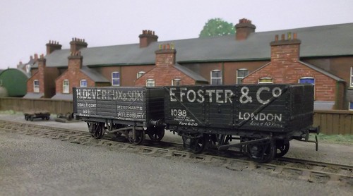
One of my favourite features are the hand-lettered wagons. Sign writing is a real skill - I've struggled to do a descent job in the past - but these look superb.
Now, if you plonked a modern RTR model beside them then many modellers would pooh-pooh the older versions as not been very sharp, but for me they work as part of a scene. Consistent standards over the entire model work so much better than a few stand-out items and the rest modelled to a lesser quality.
It has always amused me that we have people demanding higher and higher standards from the RTR makers. Their own modelling will always pale in comparison from the perfect from China so the layout will never look as good overall.
Anyway, if you wan to see more of Aylesbury, it will be in print and on DVD in a future issue of BRM and making it's one and only appearance at Railex 2016.
4 comments:
...'then many modellers would pooh-pooh the older versions'...
I would hope not. Those wagons look superb. Hand lettering is a real skill which should be appreciated and not devalued by such comparisons. Now there's a subject for a blog post (or even a series) - disappearing skills of railway modelling.
Who said items from China are perfect?
Anything is only as good at whats put into it and especially anything that involves a computer/IT.
If it was made in GB then that would be better for all!!
GOG
If it was made in GB, it might not be better but it certainly would be considerably more expensive.
My point is that if you compare these to printed RTR wagons (even those produced in Chirk), the hand-done lettering looks more home-spun and less perfect. To me, the imperfections add to the atmosphere and "look" of the model but then I prefer atmosphere to perfect prototype fidelity.
I remember this layout in the magazines and History of Miniature adn Model Railways (the weekly mags in vogue in 70s' and 80s'). It looked incredible and has stood the test of time.
Post a Comment